I tried to understand and characterize Wikipedia visits time series (also in this post Wikipedia Visits Time Series). I analyzed a random sample of English Wikipedia articles, I considered a first set of 1 000 pages and a second set of 10 000 pages. I downloaded and cleaned all their visits history for 12 months (first pages set), and for 2 months (second pages set). Looking at the data I observed two really interesting global behaviors, with two different time scales. Let’s look at the first data set, in the following plot we have the average daily visits X ( t ) for a year, that is the mean over all the N pages in the set for a certain day.
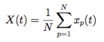
The first global behavior has a scale of a few months, that is a global decrease of visits during summer months and Christmas days. This low frequency fluctuation can be interpreted as a seasonal effect. It seems reasonable that people visit Wikipedia with less continuity during summer months. There is also a significant average decrease of visits around Christmas (red tick mark in the plot). Also reasonable, since the majority of readers is located in the Northern Hemisphere and Western World (according to Wikimedia Statistics we have main visitors origin: US 36%, UK 10.8%, Canada 6%, India 5%, Australia 3.3%, Germany 2.0%, Philippines 1.7%, Brazil 1.1%, Netherlands 1.1%, France 1.0%, Sweden 1.0%, Italy 0.9% … ). Which can explain the 15% decrease of visits during Christmas holidays and summer months.
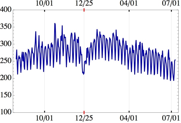
What about these high frequency fluctuations? The second global behavior has a scale of a few days. Let’s look at these fluctuations in a smaller time window. In the second plot we can see the average daily visit (but normalized this time) over a set of 10 000 random articles, for only 60 days. The blue and the dark red lines are the data (two sub-sets). The light red line is a sinus function, with a period of 7 days.
I interpreted this result as a weekly pattern, in fact periodic minima correspond to weekend days. Which means that Wikipedia is usually consulted more during working days! Did you expect that?
